We recently introduced a new component - or rather set of components - to our infrastructure to improve our ability to monitor the operations of Way to Health. Prometheus and Grafana give us clear visual metrics for how things are working under the hood.
Background
Before I dive into the details of these new tools, it’s worth giving a summary of some things it’s built upon.
beanstalkd and queues
Business logic in w2h runs in one of four contexts - synchronously in a web request, as a scheduled task, as a daemon, or via a queue.
As a quick example of each:
- Web request: When someone saves an event configuration, the server immediately validates the configuration, returning an error to the user if it’s not valid.
- Scheduled: Every hour we run a task to send program staff a daily digest with escalations/incidents from the past day. (Most staff have these set to go at 8am, but not everyone is in the same timezone.)
- Daemon: Every 30 seconds we run a database query to find active SMS conversations which are ready to be closed/expired. This could in theory be done as a scheduled task running every minute, but running it as its own daemon just makes more sense and is simpler operationally.
- Via a queue: When staff request a report, it pushes an
exportDataJob onto a queue, which will get processed in a first-in-first-out fashion by a queue worker.
That fourth category (of queue jobs) operates via beanstalkd using the Laravel queue component. Beanstalkd is a simple and rock solid queue manager. It doesn’t have all the fancy features of Amazon SQS or RabbitMQ, but it does the job and is simple to run.
health.json
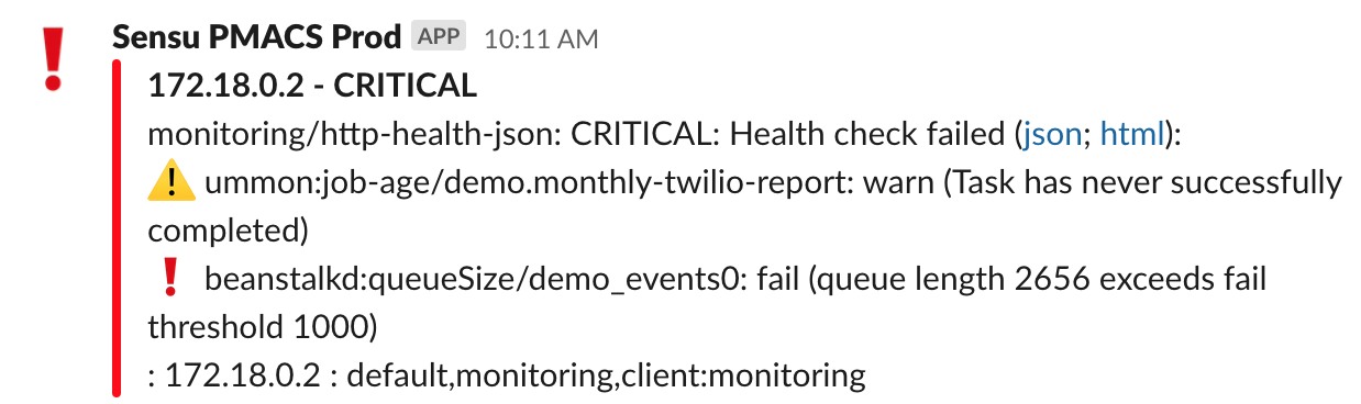
Prior to introducing Grafana and Prometheus, our application monitoring centered primarily around health.json. Our application exposes a /health.json endpoint which contains information about each of the underlying components of our system - backend microservices, scheduled tasks, daemons, queues, and so on. Each component has configured thresholds for pass/warn/fail - for example, if a task scheduled to run hourly hasn’t run in 1:30 it warns, and after 3 hours it fails. Our default queue warns if it exceeds 1000 jobs waiting, or if jobs have been waiting for more than 15 minutes. These thresholds are chosen and adjusted manually and have some amount of false positives/negatives associated with them.
We run a monitoring tool (sensu) which checks that endpoint every 5 minutes and sends a message to slack if it returns a status of fail.
This alerts us quickly to errors, but has a few limitations:
- The checks are stateless, in that they’re only looking at the state of the system at a moment in time. There are certain daemons that we pause during deploys, and if sensu checks the health.json during that window, it will report a failure because the necessary daemons are not running. Similarly, if a queue momentarily spikes to above the threshold, even if the queue clears out quickly we might see an alert pop into Slack creating alert fatigue.
- We have no ability to silence individual errors within health.json. In the screenshot above, a monthly scheduled task has not run since the job scheduler rebooted, which means that the warning remains permanently present. We don’t alert on warnings alone, but it would be nice if we could silence just that one warning.
- We get a single message sent to slack about all failing components. We customized the alert message to display each component on its own line, but it still requires some mental attention to parse the alert and see if any additional components are now erroring. When we’re mid-incident addressing issues (or post-incident and an issue is resolved but the metrics are still returning to normal) that additional cognitive load just contributes to alert fatigue.
- We have no visibility into the patterns of our queues. When we release a new queue we’re shooting in the dark in terms of where to set thresholds.
We chose prometheus because it focuses on quantitative timeseries data rather than forcing us too quickly into fail/warn/pass categorization. (And because it’s easy to run via docker.)
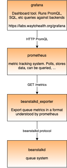
- Grafana is a dashboard tool that can connect to various data sources. Most commonly it’s used together with Prometheus, but it can also connect to SQL databases, log aggregators, or other things.
- Prometheus is a tool for monitoring and alerting, especially focused on time series data. It is the backend that collects and stores the data, and has a minimal frontend where you can run one-off queries, see graphs, etc. You can’t save graphs or create dashboards - that’s where Grafana comes in.
- Prometheus polls various “targets” to get metrics at specified frequencies. The targets are configured in prometheus.yml which is baked into our prometheus docker image.
- beanstalkd_exporter is an open source prometheus exporter which connects to beanstalkd through beanstalkd’s TCP-based wire protocol and exports metrics via HTTP using Prometheus’s format.
Both Grafana and Prometheus can do alerting. It seems like in general, the recommendation is to set up alerts within Grafana rather than Prometheus. To date (July 2021), we’re not using these for alerts yet, just for visualizing metrics.
Feeding data to Prometheus
Prometheus expects to get its metrics in a specific text-based format. By convention, it’s usually at http://some-hostname/metrics, and the format needs to be something like the below. For apps that don’t speak this language by default, typically you use an “exporter” to pull data from the application and return it in this format.
Below is a shortened version of what’s returned by beanstalkd_exporter. In this, you see a mix of:
- Metrics across the entire server
- Metrics for each “tube” (which is beanstalkd’s term for a specific queue)
- Incrementing counters (e.g. total number of times the “delete” command has been used) - you’d only really want to graph the rate of change, not the actual number. (In this data they are actually labeled as gauges, but they technically could be counters. Perhaps I’ll go and open a PR for that.)
Current stats (e.g. current_jobs_ready) which you’d graph directly as a time series.
# HELP cmd_delete is the cumulative number of delete commands.
# TYPE cmd_delete gauge
cmd_delete{instance="beanstalkd:11300"} 888629

# HELP current_jobs_ready is the number of jobs in the ready queue.
# TYPE current_jobs_ready gauge
current_jobs_ready{instance="beanstalkd:11300"} 836

# HELP total_jobs is the cumulative count of jobs created.
# TYPE total_jobs gauge
total_jobs{instance="beanstalkd:11300"} 885380

# HELP tube_cmd_delete is the cumulative number of delete commands for this tub.
# TYPE tube_cmd_delete gauge
tube_cmd_delete{instance="beanstalkd:11300",tube="backfill"} 0
tube_cmd_delete{instance="beanstalkd:11300",tube="default"} 32390
tube_cmd_delete{instance="beanstalkd:11300",tube="events0"} 63914
tube_cmd_delete{instance="beanstalkd:11300",tube="events_progressive0"} 0
tube_cmd_delete{instance="beanstalkd:11300",tube="exports"} 0
tube_cmd_delete{instance="beanstalkd:11300",tube="high"} 13
tube_cmd_delete{instance="beanstalkd:11300",tube="low"} 16
tube_cmd_delete{instance="beanstalkd:11300",tube="sync"} 14938
tube_cmd_delete{instance="beanstalkd:11300",tube="sync_fitbit"} 51560
tube_cmd_delete{instance="beanstalkd:11300",tube="sync_fitbit2"} 52609
tube_cmd_delete{instance="beanstalkd:11300",tube="sync_fitbit3"} 51171
tube_cmd_delete{instance="beanstalkd:11300",tube="sync_fitbit4"} 49166
tube_cmd_delete{instance="beanstalkd:11300",tube="sync_fitbit5"} 51103

# HELP tube_current_jobs_ready is the number of jobs in the ready queue in this tube.
# TYPE tube_current_jobs_ready gauge
tube_current_jobs_ready{instance="beanstalkd:11300",tube="backfill"} 0
tube_current_jobs_ready{instance="beanstalkd:11300",tube="default"} 11
tube_current_jobs_ready{instance="beanstalkd:11300",tube="events0"} 744
...
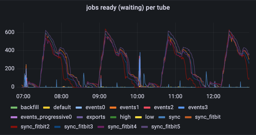
One initial interesting takeaway
Looking at the graph of what jobs wait in the queue, you see lots of fitbit jobs waiting, with some occasional spikes of events to be processed (usually on or shortly after the hour). Based on this, one might assume that these are the vast majority of the jobs going through our queue. The second graph below shows otherwise - the fitbit jobs are constantly being processed at a low rate, but there lots of default jobs that don’t show up in the top graph at all.
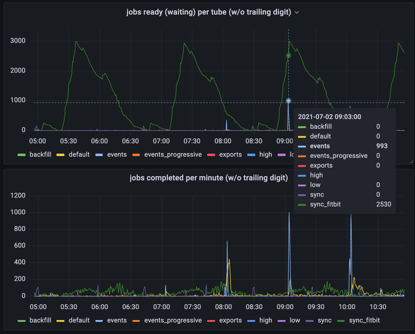
Estimating job volume based on the first graph is like trying to estimate airport volume by taking photos of the check-in or security lines. You might conclude, “I almost never see any first class passengers waiting in line to check in - there must not be very many of them”. In truth, there are lots of first class passengers, but the first class check-in line is staffed to process those passengers right away. The “fitbit” jobs are analogous to the coach passengers who manage to get cleared just in time for the passengers for the next flight to arrive.
Future directions
- Alerting. To start, we’ve set up these tools only to monitor with no alerts set up at all. Once we have a week or two of data, we’ll set up alerts within prometheus or grafana and gradually migrate them out of health.json.
- Dynamic thresholds for queues: Currently health.json has hardcoded thresholds. Which means we need to set them, guess at what a problematic value is, and deal with false positives when it briefly goes above that. Prometheus and Grafana should let us set triggers like: “Alert if the queue stays above 1000 for more than 5 minutes” or “Alert if this queue length gets longer than 120% of its 2-week high-water-mark”.
- More granular alerts: As mentioned above, a general limitation with our health.json approach is that we get a single message in slack for the entire platform, listing all the problems. A dedicated alerting tool will let us build more granular alerts, silence them, adjust them, etc.
- Data sources: To start, the only data we’re pulling into prometheus is beanstalkd data. In the future, I see us pulling in additional sources of data, such as:
- Daemon runtime info from pm2: Restarts per minute are impossible to capture with our current health.json approach. Health.json/Sensu also throw errors into slack when daemons are down during a deploy. Ideally what we’d want is to only be alerted if daemons are down for more than ~3 minutes (the typical duration of a deploy)
- Integration message data from Mirth Connect: Some of these can be fetched from the API (the same API endpoints powering Mirth’s dashboard), others (e.g. performance) might require either looking at individual messages via API or pushing data to a logging tool
- Error rate - if a channel normally errors once or twice per day and now it’s erroring 60 times a day, that means something is up.
- Performance - is a channel slowing down over time?
- Volume trends - if a channel is suddenly enrolling twice as many or half as many participants as yesterday/last week, that might indicate something.